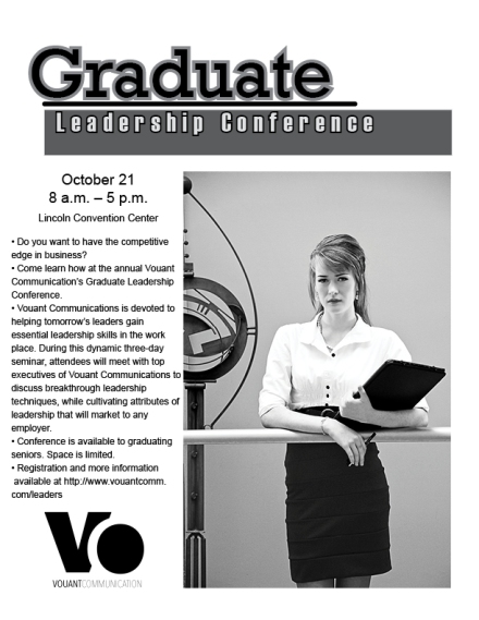
For our first project we did a flyer for a Graduate Leadership Project. I was so out-of-it when I read the project details that I did it wrong the first time. I’m worried I may work myself past the point of exhaustion again. The killer was holding my 27 lbs. Back End Development textbook while I read it. I set it against things, but I still have to lug it around. I’m suppose to not lift more than 12 lbs due to my back. It just wore me out. I am getting shots in the area in June. Hopefully it will make a difference. The low back ones sure did.
I struggled with the 36 principles of design in ART 130, only getting a few of them and many of them I had no clue what they meant. I got a different perspective from my amazing Typography class (the study of type) so I am glad to get back expanding on the stuff I learned in ART 130 again. I worked really hard on my negative space and contrast in this piece. I am amazed that I am actually looking at what I envisioned for the project when I started. I think that shows I, at least, have a clue. A clue to what? We shall see…

This is my finished flyer. It was printed in 72 dpi RGB because the contrast didn’t come out right the Leadership Conference portion when I printed grey-scale.
Project Data
Description: Flyer for a Graduate Leadership Conference
Process (Programs, Tools, Skills, FOCUS principles): InDesign, Photoshop, pencil, Pilot G2 Black Pen sketchpad, Alignment, Contrast, Value and Proximity
Message: Let us help you make it in Leadership.
Audience: Grad students from the College of Business and Communication
Top Thing Learned: I am not overly comfortable with a lot of white-space.
Title Font Name & Category: Rockwell (Slab Serif)
Copy Font Name & Category: Arial (Sans Serif)
Links to images used in this project: https://wil12045.wordpress.com/wp-content/uploads/2015/05/daniel-wilhelmt-indesign-flier.jpg
