My Convoluted Message in Pink

This week are learning how to create photo montages.

These lyrics really spoke to me. So much so it pointed me back heavenward when I was lost.

These lyrics really spoke to me. So much so it pointed me back heavenward when I was lost.


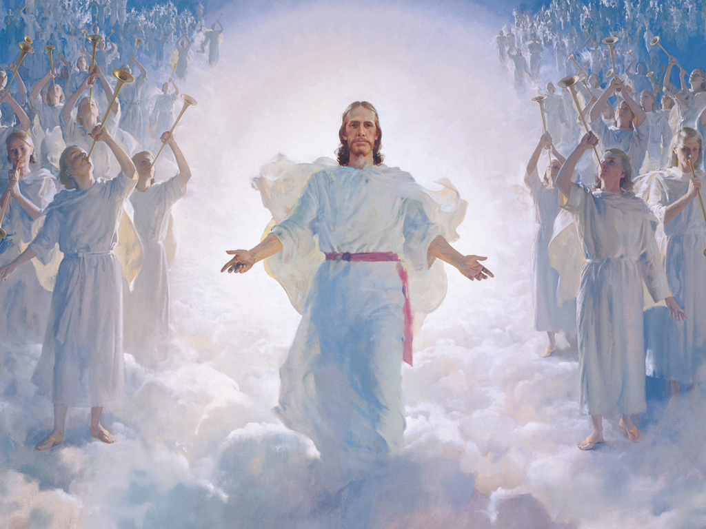
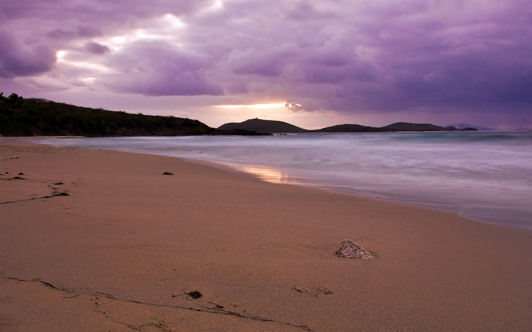
Description: The lyrics speak of the pre-existence, the path we are on and that memories of the pre-existence points us toward the next life. The path we need to take to get back to the place we were before is the Savior.
Process (Programs, Tools, Skills, Steps taken while designing): Photoshop. I thought up the concept. Found the lyrics and photos. Placed them in the image and fit the Savior in faded in the background. I worked to match the colors and placed things the best I could.
Message: The ‘force of some inner tide’ pushing us forward is the Savior.
Audience: Anyone
Top Thing Learned: Design is hard. I can see what I want, but cannot get there with Photoshop very easily. I need more experience.
Filter / Colorization used and where it was applied: Sharpen Edges on the Savior
Color scheme and color names: Fuchsia, Pink, Purple and White. Monochrome
Title Font Name & Category: Centaur 60pt/58 leading Oldstyle
Copy Font Name & Category: Floydian 20pt Handwritten
Thumbnails of Images used:
thesecondcoming_1024x768

empty-beach-at-dusk-hd-beach-wallpapers-1080p

Sources:

Proof Video

Wonder Woman in the Windowsill…

Wonder Woman in the Windowsill... She guards our home .

Wonder Woman in the Windowsill…
She guards our home .

This is for my COMM130 class, but I designed it for my developmentally disabled brother Aaron. He loves the fact that she–along with Santa Claus and Good King Wenceslas, whom I removed for the picture–are in the window. She is like a grotesque on an old church or building to me. Always vigilant and never failing. I look at her a lot and I wanted to use her in the project both for Aaron and because imagery is almost poetic to me. I love the way the green grass and the blue and red on Wonder Woman go together. I tried to use them for my color scheme, but they looked ridiculous. I finally chose to go with the colors I chose because they are in the picture and they make the photo stand out. I’m not good at this. It looks terribly gaudy. But I like the image because of the symbols it represents.

Proof of Printing

The Details

Description: This is a scene I have been contemplating for a couple years now. The colors is what I like the most. The rust curtains, thee green lawn, even our neighbors van all match Wonder Woman perfectly. I love looking at it.
Process: I used my Kodak Easyshare DSL camera to take the picture. I used portrait mode to get the detail and took the focus in a tightly as I could. I tried to frame it like I saw it in my mind and it turned out awesome. However, it wasn’t right for the project, so I took a bunch more this was the best of the group.
Programs: Photoshop
Tools: Canon Printer and Scanner, Kodak Easyshare DSL camera, Lenovo Thinkpad and 25# laser printer paper.
Skills: Medium level Photoshop user, photography
FOCUS Principles: Alignment bases on 3rds, color, value, repetition (rule of odds),
Message: Wonder Woman is guarding our house.
Audience: My brother Aaron and those of us who love him.
Top Thing Learned: I am not very good at this. My photo is awesome. My photoshop skills are wonderful, until I had to do the typography. I had an amazing color scheme in mind, but had to take them from the color wheel. All the combos I tried looked terrible until this one. I learned that this is hard.
Color scheme and color names: Analagous Red-Brick-Violet
Title Font Name & Category: Palatino Linotype Bold 70pt
Copy Font Name & Category: Palatino Linotype Regular 30pt

Original Image

Original Image


Taken May 21, 2015 in my front room.

>^.”.^< Dan

Project 3 – Six Images

Mission: Find the Light - Outside - Clear blue sky with my moon.

Mission: Find the Light – Outside – Clear blue sky with my moon.

Dan Wilhelm - P3 Shot 2 Find The Light - Inside

Mission: Finding the Light – Inside – Mesa Temple and the Savior three times bathed by AZ sunlight.

Dan Wilhelm - P3 Shot 3 Control the Focus - Foreground

Mission: Control the Focus – Foreground – Santa Claus, Wise Man and Wonder Woman. (Yes, we keep them up all year for my developmentally disabled brother to see).

Dan Wilhelm - P3 Shot 4 Control the Foucs - Background

Mission: Control the Focus – Background – Brother’s three wise men in the window.

Dan Wilhelm - P3 Shot 5 Plan the Composition Strong Leading Lines

Mission: Plan the Composition Strong Leading Lines – Family Room wall.

Dan Wilhelm - P3 Shot 6 Plan the Composition  One Third Grid Lines

Misson: Plan the Composition One Third Grid Lines – Samsung HDTV and Family Room wall.

I’m basically a novice with my DSL camera. It does have a ton of modes to shoot in. I just did a straight, no flash shot for the first one. The moon was in the sky acting as a second light. For the second shot I focused on the Mesa Temple picture on or wall and adjusted the telephoto lens in a bit. I used smart mode on it. My third shot I used smart mode. On my fourth I used the night shot mode. I think it turned out better than the third shot. My fifth shot I used landscape mode and the final one I brought the lens in closer. I’m not a photographer, but I’d like to learn how to use the camera better.

I used Photoshop to touch up the photos. I used the Levels tool to control the balance between light and dark in several shots. I used the hue/saturation tool very lightly on one photo and I used the color select tool on the blacks in the fifth image. I used the Vibrance tool several times and finally the Sharpening Tool. I learned somethings from the Photoshop tutorial one of the TA’s made. All in all, this was a fun project.

>^.”.^< Dan

Project 2: Fun with Event Flyers!

This is my final event poster.

This is my final event poster.

Description: A flyer for Archangel Foundation of Arizona to benefit the Officers of the East Valley DUI Task Force.
Process (Programs, Tools, Skills, FOCUS principles): MS Word, Adobe Reader, Pen, Paper, 25# laser printer paper, printer, typography, design layout, alignment, hierarchy, asymmetry (picture), color, gestalt and focal point.
Message: Invites people who do not care what the cost is to attend a fundraiser to benefit Officer of the East Valley DUI Task Force.
Audience: Upper Class and Business Owners. People who want to be noticed or believe in the cause.
Color scheme and color names: Triadic Blue, Red and Yellow
Top Thing Learned: I learned how to use Word to design flyers better. I use it quite often to do the plain old boring flyers I do for church. I never dreamed I could make one this nice. There were limitations. I couldn’t adjust the leading on the way I wanted to on my second attempt at this poster. It just looked terrible.
Title Font Name & Category: Daniel Black – handwritten
Copy Font Name & Category: Minion Pro – serif
Scanned images used, sources, original sizes, location of scanner used: I used the scanner in my home. I copied the image from a Best Foods Mayonnaise ad found in a People Magazine. I scanned a 3.167 x 3.877 inch image at 300 ppi and stretched it to just over 8 1/2 x 11 to get rid of some stray edges.

Video Proof of my scanned image.

I’m pleased how this turned out. It’s going in my portfolio right now!

Project 1 Fun with Flyers

For our first project we did a flyer for a Graduate Leadership Project. I was so out-of-it when I read the project details that I did it wrong the first time. I’m worried I may work myself past the point of exhaustion again. The killer was holding my 27 lbs. Back End Development textbook while I read it. I set it against things, but I still have to lug it around. I’m suppose to not lift more than 12 lbs due to my back. It just wore me out. I am getting shots in the area in June. Hopefully it will make a difference. The low back ones sure did.

I struggled with the 36 principles of design in ART 130, only getting a few of them and many of them I had no clue what they meant. I got a different perspective from my amazing Typography class (the study of type) so I am glad to get back expanding on the stuff I learned in ART 130 again. I worked really hard on my negative space and contrast in this piece. I am amazed that I am actually looking at what I envisioned for the project when I started. I think that shows I, at least, have a clue. A clue to what? We shall see…

My finished flyer.

This is my finished flyer. It was printed in 72 dpi RGB because the contrast didn’t come out right the Leadership Conference portion when I printed grey-scale.

Project Data

Description: Flyer for a Graduate Leadership Conference
Process (Programs, Tools, Skills, FOCUS principles): InDesign, Photoshop, pencil, Pilot G2 Black Pen sketchpad, Alignment, Contrast, Value and Proximity
Message: Let us help you make it in Leadership.
Audience: Grad students from the College of Business and Communication
Top Thing Learned: I am not overly comfortable with a lot of white-space.
Title Font Name & Category: Rockwell (Slab Serif)
Copy Font Name & Category: Arial (Sans Serif)
Links to images used in this project: https://wil12045.files.wordpress.com/2015/05/daniel-wilhelmt-indesign-flier.jpg